As Feathered #3 gets closer to completion (2/3 done) I’ve started to think more and more about covers. Normally about now I’d be advising my cover designer to start work on the cover for the third book and give him a brief on the design, however I’m seriously contemplating going in a new direction.
I’m torn.
While I love the simplicity and professionalism of the current covers, I’m not sure it’s clearly conveying genre. When I head over to Amazon and look in the Paranormal Romance section, the predominant type of cover is those with people on them. Sure, there are covers with have symbols or one element (Fifty Shades, Sylvia Day’s covers, etc) but I’m not in the same league as those authors, so I may need to go bang on with what the audience will see.
Okay, so here’s where my head is.
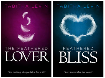
The current covers look like this (without the third since it hasn’t been created yet):

Lovely, right? I think so too.
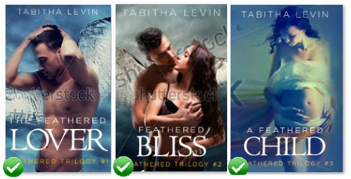
But here’s what I think I need to do (keep in mind that these are very rough mock-ups, still have the stock watermarks on them, text etc is not properly laid out, and the images are badly photoshopped/pixellated, and they have green ticks on them). If I decide to go this direction, then I’d buy the images and clean them up to look better, of course.

The professional covers look better: more, well, professional. But the mock up’s I’ve done convey genre well and you can tell immediately what the book is about.
I still don’t know which way to go. Like I said, I’m torn.
I guess I’ll have to make a decision soon, though. This book is nearing completion and I’ll be sending it to the editor in two weeks.
Dilemma, dilemma.
Tabs xx
P.S. If you have an opinion on the cover, I’d love to hear your thoughts below.
Leave a Reply